Welcome to week two of #fontface – our new series dedicated to introducing you to the awesome type designers and foundries on MyFonts. This week, get reintroduced to long-time type designer Neil Summerour of @positype.
Neil is a type designer, lettering artist, calligrapher, designer and teacher based in Georgia. “By all logical conclusions it really looks like I am a workaholic but I love what I do,” he said in his Creative Characters interview. “Each creative thing I do fuels every other part.”
Since it’s founding in 2002, Positype has published over 500 fonts, including an incredible collection of text and display faces. “Type is the first and last thing read by your clients’ customers. As cliché as it sounds, it can make or break a project. Developing distinctive, responsive typefaces always rests in the back of my mind now when I sit down to draw,” he says.
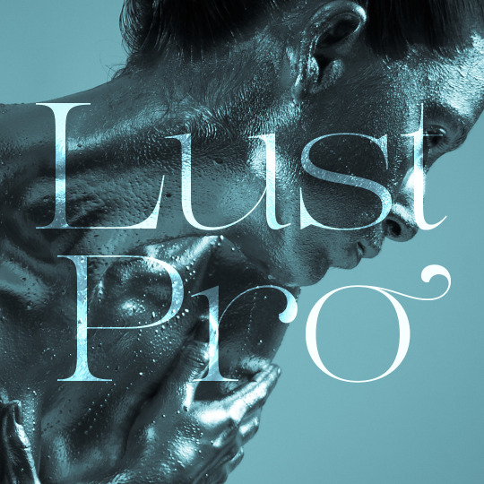
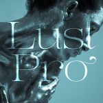
Just this week, Neil released his latest typeface, Lust Pro; a project that he calls an “exercise in indulgence—an attempt to create something over the top and vastly useful.” Read more about his newest design, his workspace and his overall process in this edition of #fontface.
I do not like being on this side of the camera… ever. Which unfortunately means you won’t see many selfies of me, but I really like this picture my daughter Isobel took of me. She is amazingly good with a DSLR at age 6. Seeing what she sees is a daunting reminder of the role I have in her life and it keeps me from obsessing over type all of the time.
For me, some of the most engaging ways to experience type is alone. By alone, I mean one letter at a time, large, period. This is an ampersand from a typeface I have been tinkering with since 2014… that will finally be released next year, in 2016. Some people say it’s smiling, can you see it?
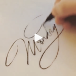
To produce the marketing materials behind the TDC2 winning typeface, Flirt Script, it and me trolling around the streets of Athens, GA at 2am. I wanted a certain mood and feel to the images that would soon feature animated strands of light. To see more go to flirt.positype.com to see the video. Those pics almost landed me in jail—some of those places didn’t like a guy lurking around with a camera… oops.
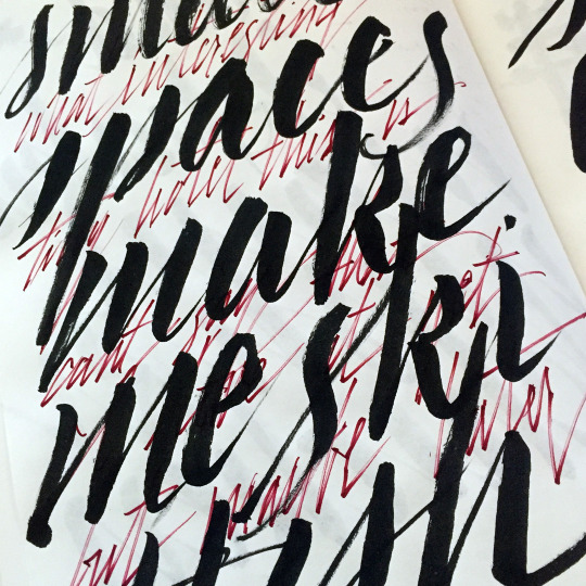
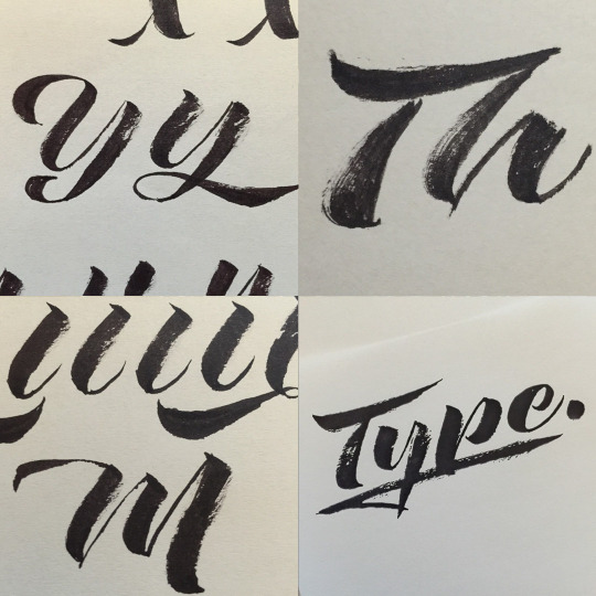
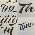
Oh my, sketchbooks. I believe in them. Typically, they get filled with lots of doodles, specific notes on a typeface as I am working on it, and lots and lots of layering. This page has me working with a sumi brush & a Zig Cocoiro pen. Sketchbook of choice… I buy sketchbooks (in bulk) from a small company in Tokyo called MUCU.
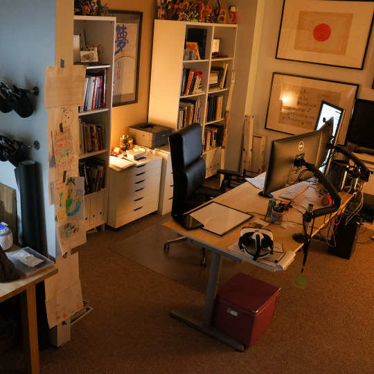
Since it’s just me, I do not work in a flashy studio or co-work space. Instead, I prefer the quiet of my custom-built studio space at home. You cannot beat the commute 😉 Since I work in both analog and digital form, I chose to split those work areas… even down to the lighting (warm, for digital; cool, for lettering).
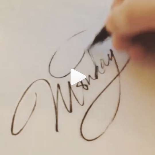
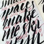
Every morning, before I begin whatever workflow I have for a client or a new typeface, I always set aside time to letter. I enjoy working with sumi brushes of various sizes and anything with flexible ends—I constantly try to keep my touch light and my emotions heavy—in an attempt to always have control of the contrast. (there’s a zen message in that somewhere)
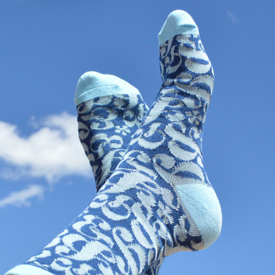
One of the coolest uses of one of my typefaces was socks… yep, socks. Set in ampersands from my typeface, Lust, the people at @wearefairgoods just knocked this out of the park… loved it. And, if you made to TypeCon this year, you got a free pair in your goody bag.
When I make a textured typeface, it is informed from actual texture, from actual lettering… no filters, no plugins. The Rough Love & Love Script typefaces were based on some of these specimens. Just FYI, the one in the lower right is actually the font, printed out.
So, this typeface just dropped. It is the enormous expansion to Lust, called Lust Pro. With the launch of this typeface, comes the launch of entirely new materials to showcase the entire Lust Series. I couldn’t be more happy with the collaboration with Daniela Nomura @daninomura who conceived and shot all of the photography specifically for the typeface! LustProFonts.com is the place to go to see it all
Here are two 4’s from Lust Pro. I receive a fair amount of email from people about the typefaces I make (people are so insanely nice) and many of them call out the 4’s of the Lust Series as some of the most intriguing characters they’ve seen… um, blushing now. I try very hard with my typefaces to have my typefaces look like they came from someone’s hand and not just from a computer… comments like those, are sweet affirmations.